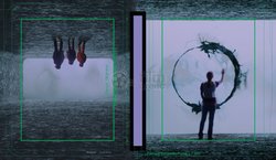
Arrival (Blu-ray SteelBook) (FilmArena Collection #68) [Czech Republic]

snooloui

The 'Negative' Ninja
Premium Supporter
Feb 12, 2012
12,034
UK
Release date: March 15, 2017 (Standard) - April 19, 2017 (FAC)
Purchase links: Standard - FAC
Price: 699 CZK (Standard) - 899 CZK (FAC)
Note: Limited to 1000 numbered copies
HDN Group Buy: hosted by carllenc

16665132_1649195895096958_2657487088027561466_o-jpg.292428

Arrival.JPG
film_23063_3.jpg film_23063_4.jpg
 
I contacted FA about this and have given them some feedback from this thread. They've told me that the design is that the spaceship replaces the 'I', which I'm sure we are all well aware of. It seems as if this design has been finalised so I don't think anything will change.

We can hope though. If not, come on HDZeta

That's too bad. I will, however, be buying this even with the missing "i" because this was my favorite film of 2016 just ahead of La La Land.

If a better version comes along, as much as I prefer to never buy two of anything, I will buy it. Not taking any chances by passing on this.
 
  • Thanks
Reactions: AlienKing
Well that's too bad...
I think it was obvious that the designer aimed for a replacement for "i". But it's just executed poorly. It doesn't have the same size, shape or letter spacing. It just feels like the space ship is too big so that the "i" is covered.
I also wonder that Sony actually approved that.
Well, I'll pass then.
 
I'm out then... the title looks really odd without the 'I', and even the position of the text looks all wrong to me. I'd rather they just removed the title on the front completely to be honest. Plus I'm not even a big fan of the steelbook art either, so I'll just settle for Zavvi's version, which hopefully stays with the current artwork being shown.
 
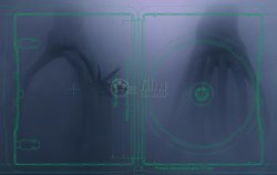
Oh, man. Somehow, learning that there was a designer who actually made the decision that the spaceship will be a big "I" makes the whole product really uncool. It's one of those "Did you even see this movie?" moments. If the lenti magnet is as meh as the rest of this package, then I'll just go with the Zavvi, which I've thought from the beginning is the much more stylish design. Someone could create a very nice premium set based around that steelbook (and I hope they do).
 
Maybe they could add the pieces of the I on the ground, under the ship? As if it just landed really fast and smashed through the title?

(This cover is starting to feel like a Monty Python cartoon...)
 
  • Thanks
Reactions: wjasoncul
If they want to keep the design, then simply improve the proportions of the spaceship by decreasing the size to signify the "I" properly which would also help the spacing between the letters.