Die Hard (Blu-ray SteelBook) (Zavvi Exclusive) [UK]

snooloui

The 'Negative' Ninja
Premium Supporter
Feb 12, 2012
12,034
UK
Release date: October 8, 2013
Purchase link: Die Hard
Price: £14.99
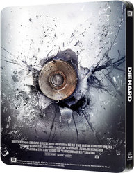
Notes: Includes embossed artwork. Matte finish. Embossed

dh1.jpg

dh2.jpgdh3.jpg

Official HDN video:
 
Last edited by a moderator:
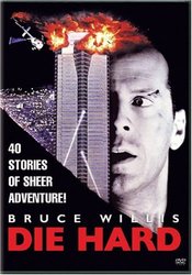
I'm hoping that they don't use this artwork.

51IFR-1DbzL._SY355_.jpg


And knowing fox, it'll be matt finish again.

quite the opposite in all honesty. i love that key theatrical artwork and really hope they use it.

it should look more like this with the red title debossed but without the tagline on the side

attachment.php
 

Attachments

  • die_hard_01.jpg
    die_hard_01.jpg
    41.7 KB · Views: 91
  • Like
Reactions: lolwut
One of my favorite movies of all time, the artwork for this better be perfect. :)

None of that re-release modernized crap art for the cover, original key art all the way IMO. It'd be great if there was artwork obscured underneath that slash of black in the lower left of the poster, but even if not, a classic cover can still be had...

diehardo.jpg


With nothing but the title debossed?! I would cry sweet tears of joy.
 
that's perfect!!!

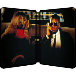
i would proberly have the shot of John shouting through the window (welcome to the party pal!) as the inner artwork though but i'm just being fussy

this is one of my alll time fav films and i really hope this release does it justice!
 
The problem with the "Welcome to the party pal" shot is that it's framed with John on the right, which would leave him under the disc, and I hate when they do that.

The only problem with the duct shot, classic as it is and perfect as it seems, is that the spine runs right through the middle of his face, which looks a little strange IMO...

diehardi.jpg


Still looks good, and wouldn't really necessitate having to take the disc out to appreciate it, which is always a plus... I wouldn't complain if they went with that.
 
"Come out to the coast, we'll get together, have a few laughs..."

I don't mind him being in the middle of the spine, also leaves space for discs to the side of it.
 
quite the opposite in all honesty. i love that key theatrical artwork and really hope they use it.

it should look more like this with the red title debossed but without the tagline on the side

attachment.php

I take it back bigrob. Actually with tht mock up, it looks pretty damn good. On my old VHS which I threw out, it looked awful. But th mock ups here looks good.
 
One of my favorite movies of all time, the artwork for this better be perfect. :)

None of that re-release modernized crap art for the cover, original key art all the way IMO. It'd be great if there was artwork obscured underneath that slash of black in the lower left of the poster, but even if not, a classic cover can still be had...

diehardo.jpg

With nothing but the title debossed?! I would cry sweet tears of joy.

I would buy that no question. Sometimes poster art is the best. Sometimes fresh artwork looks good, but sometimes it just fails badly (see Rambo: First Blood Zavvi Exclusive).