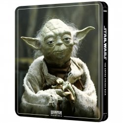
Star Wars: Episode V - The Empire Strikes Back (4K+2D Blu-ray SteelBook) (Zavvi Exclusive) [UK]

Noodles

Super Moderator
Premium Supporter
Feb 28, 2011
43,263
UK
Release date: August 3, 2020
Purchase link: Zavvi (Pre-order on May 21, around 9 AM for Red Carpet , at 12 PM general sale - UK time)
Price: £29.99
Note: 3 discs

12584863-1924769381743461.jpg

12584863-1244769382074100.jpg 12584863-1434769381918943.jpg
 
Last edited by a moderator:
Just wanted to share my Official Zavvi contact has passed along their Reddit post (with the same reactions seen here) to their manager who passed it along to the appropriate Zavvi team member. Hopefully our opinions will be heard.

Unfortunately we all know Disney is really strict about artwork, especially once they’ve made up their mind. Just wanted you all to know Zavvi is aware of the feedback,

Can we reach out to Disney?

Also look at this:
lu32k78a8jz41.jpg
 
Last edited by a moderator:
Ugh, we'll probably get that lightsaber poster for RotJ now. That's not even a terrible poster on its own really, it just isn't anywhere near as good as the poster featuring the cast.

How can they get ANH so perfect, and Empire so so badly wrong?
 
  • Like
Reactions: Leafs17
Ugh, we'll probably get that lightsaber poster for RotJ now. That's not even a terrible poster on its own really, it just isn't anywhere near as good as the poster featuring the cast.

How can they get ANH so perfect, and Empire so so badly wrong?
ANH will be gloss and bossed - ESB will be Matte and Flat....
 
  • Haha
Reactions: MM3 and DMD4k
I have no interest in pre-ordering either this or the New Hope one because I don't collect 4K Blu-rays. However, I wanted to give my two cents about the design of these steelbooks.

Why on earth are they using the new Disney-style logos for these? Ever since The Force Awakens, every main line Star Wars film (and now apparently the old ones) use the similar logos, that have the basic Star Wars logo/text and the names of the movies in between the Star Wars logo, using the exact same font every time. It's so lame. All the original trilogy films have very distinguishable and beautiful original logos, whereas all the Disney-era films (and re-labels of old films) use the same generic, boring logos that just scream STAR WARS in you face so that nobody would mistake them for anything else.
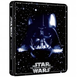
I 100% agree. The font for “Star Wars” and “The Empire Strikes Back” are iconic. Even the odd choice just to use Times New Roman for Revenge of the Jedi is oddly iconic.

And I could be wrong, but I’ve not seen those fonts used for Star Wars film releases since the pre-1997 special edition releases. All the DVD’s, Blurays, and Laser discs since have all had the modern Star Wars Logos.

This would have looked good as steelbook artwork


I’ve never seen this before. xD
What kind of cursed image of this? This is worse than the Special Edition Poster for Empire Strikes Back!!!


They sure do. Very plain. Here’s an example of a recent teaser. I don’t think anyone want this on a steelbook lolView attachment 471946

LOL. I used to work at a movie theatre and I still have this poster sitting in my closet. I have a bunch of Star Wars friends but BECAUSE it’s the Rise of Skywalker, NO ONE wants this poster. xD
 
  • Like
Reactions: Leafs17