Quality of Spines on Steelbooks

Status
Not open for further replies.

SimonLDT

Liquid
Premium Supporter
May 30, 2012
1,419
Coventry, UK
Since I've been 'hardcore' collecting the past few months I've noticed more and more how many releases have really poor print quality/resolution on the spines. Is it just me that has noticed this or is it commonplace?

For example, I got Thor and the Paramount logo and the text that reads 'Marvel Studios' above the title is really blurred and practically unreadable. I understand that the print is small but any small print or logos on the front/back are so much more clearer.

Obviously I'm being really critical here but am just wondering if others have noticed it or not.

Some steels the spine looks razor sharp but on many others not so much. Another example is the recent Batman Best Buy steels, the Warner logo actually looks pixelated when you really look close, yet on the rear it is crystal clear!
 
My apologies for posting in the wrong forum.

Not necessarily wrong, because its good conversation and topic. However reps for Scanavo(steelbook) check this section so this kinda helps put the issue in the limelight.


I'm a big lover of well done spines as its the spines I see everyday. "Warrior" has a great spine. So do Unstopablle, Knight and Day, and A-Team Japan.
 
  • Like
Reactions: ash333
And by the looks of it, the HMV Avengers steelbook is gonna have a brilliant spine
 
And by the looks of it, the HMV Avengers steelbook is gonna have a brilliant spine

Gonna put my neck on the line here EEK! But I am really not a fan at all of these spines on titles like Tin Tin and the upcoming Avengers. I like to read the title of my steelbook movie not guess what it is by the characters on the spine.
Ohh boy here we go........:p
 
The Avengers one will be ace (I also think it'll be unique as all other editions seem to have the title on the spine).

Anyhow, to get back on topic I'm talking specifically about the print quality, not how they look design-wise.
 
Yeah stay on target lol

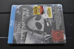
I bought a crow from Germany... The steelbook not the bird. It has a huge lump sticking out of the spine either to much glue applied or badly creased when attached either way it looks very lumpy I have tried to push it back down but with no luck. Other one I had was final destination 4 Germany the spine label had been applied upside down?

you sure its upside down? any inside art to confirm this? If so, you could pop the plates off and switch them and now it would all be correct.
 
Sorry for the bad photo but if you compare my photo of the spine to the regular spine image mine has been glued on the wrong way
 

Attachments

  • DSC_0882.jpg
    DSC_0882.jpg
    79.8 KB · Views: 164
  • 51SW0PckSHL._AA240_.jpg
    51SW0PckSHL._AA240_.jpg
    14.8 KB · Views: 161
Sorry for the bad photo but if you compare my photo of the spine to the regular spine image mine has been glued on the wrong way

Or as Wreck said, the covers have been put on the wrong way round. Probably the more likely scenario and an easy one to fix.
 
Still one of the top 3 steelbook spines in my collection and the print is sharp on the artwork and title on the spine:

7067108833_c9bc6c887d_z.jpg
 
True Grit, Inception (German 1st release), District 9 (UK), Shutter Island (FR), Battlestar Galactica: The Plan (UK) all have razor sharp print quality on the spine. On these you can even see the small Trademark (TM) logo on the blu-ray logo with clarity.

Some of the latest Fox Play.com releases have blurry spines. The Universal ones fair MUCH better (I have the 2 hulks and the quality on those is sharp).
 
Status
Not open for further replies.