Release date: TBA
Group buy: hosted by Wreck
Note: 4K + BD + Bonus disc


Group buy: hosted by Wreck
Note: 4K + BD + Bonus disc
Last edited by a moderator:
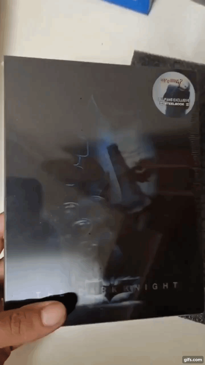
but it's a extra gif, or it's THE gift (like the weapons cage in the BB OC)?So this is the special extra gift to make up for the constant delays.... stickers
View attachment 544285
View attachment 544286
View attachment 544287
")
LOL that’s an absolute joke! LiterallySo this is the special extra gift to make up for the constant delays.... stickers
View attachment 544285
View attachment 544286
View attachment 544287
Nice embossed spot gloss on the bat logo. Looks great.
If you look at the OC beauty shots they all have a different finish on the symbol and then TDK & Rises seems to have an extra finish on the box (rises has transparent laser stamping on the title bat logo and embossed UV on bane)Nice embossed spot gloss on the bat logo. Looks great.
They were on ebay.Truly flabbergasted there are still no pics of the TDK OC.
Now that is miles better than the begins SL.This has the potential to be my new favourite slip. Memento Kimchidvd vibes
I quite like the Begins single but I agree this is a different level. The similar artwork and dichotomy of the two characters just makes perfect sense to be a transition. I have a feeling the rises will be of similar quality to this one and they made begins a transition just to keep them consistent but with less artwork options to play with.Now that is miles better than the begins SL.
And it’s because the art is similar, works so much better. Begins is 2 completely different images and it’s frustrating. This is soooo much better
Also on those pics the other day I thought Dent was also on the lenti but he must be on the back.
I’m worried for the full slip though. Because the 2 joker arts I want hasn’t been used yet and I have a funny feeling they won’t be (the one where he’s in the street facing forward and the one with his back to the screen)
Yeah I agreeI quite like the Begins single but I agree this is a different level. The similar artwork and dichotomy of the two characters just makes perfect sense to be a transition. I have a feeling the rises will be of similar quality to this one and they made begins a transition just to keep them consistent but with less artwork options to play with.
You are correct. Dent is on the back. Quite like it this way. Keeps the front contrast of Batman and the Joker while making the slip consistent overall.
Those two posters would make a good front and back of the fullslip to be honest
Considering Begins FS, I guess it will be the poster of the film, too.Intrigued to see which artwork they go with for the full slip
really THE posterConsidering Begins FS, I guess it will be the poster of the film, too.

My TDK OC has already shippedIn the end, will this or TDKR OC shipped first?
 (finally).
TDKIn the end, will this or TDKR OC shipped first?


