The Shining (Blu-ray SteelBook) (Zavvi Exclusive) [UK]

apsmith21

Operations Director
Staff Member
Aug 6, 2010
28,440
USA
Release Date: February 10th, 2014
Price: £14.99
Buy Link:
Zavvi
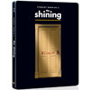
Notes: Zavvi Exclusive Steelbook with Matt Finish and Embossed Door and Title Treatment. This product is limited to 4000 copies.


Pre-order goes live September 7 2013

Artwork:
10851837-1378457196-493258.jpg


10851837-1378457235-670947.jpg


10851837-1378457254-643414.jpg
 

Attachments

  • thumb.jpg
    thumb.jpg
    21.7 KB · Views: 310
Last edited by a moderator:
Well, this sure beats the basic US amaray.... it is not great, but not bad either. Definite buy for me.

One of the 3 great "true" horror movies that have withstood the test of time: The Exorcist, The Shining, and Halloween.
 
Not too exited about this one to be honest. I like the artwork, but it just feels a bit too clean and safe. I think the door would need to have some really impressive emboss/deboss for me to double dip. I like this design style for 2001, but that's just a different movie.

What about the typewriter scene?

____

I might get this one if you promise to do Barry Lyndon next, Zavvi (I love the Barry Lyndon poster version that was on the UK snapcase cover)!!
 
The should change the back with him busting through the door.
Like the one oxo66 posted.

I also like the design with the carpet and Danny playing on it as well.
 
wow...I'm sorry to say this but almost every single thread of new steelbooks posted all say the same thing about the artwork....that they all SUCK! and you know what... you're all RIGHT!!!

what the hell is up with all this LAZINESS!!?!? bottom line is with so many steels being released nowadays, if you want us to keep on continuing to collect then STEP YOUR GAME UP!!!!!

this message isn't to any one specific retailer or film distributer, its to everyone! c'mon PLEASE look at some of the amazing art some of our very own members put up before you decide. I understand everything has to be approved by the heads of the company but a freakin' door with "redrum" written on it as the front cover!?!? c'mon!!
 
Fronts mediocre,insides good ,back is good.whatever i am buying it:)

---------- Post added at 03:18 AM ---------- Previous post was at 03:15 AM ----------

^ Yeah, DJ, preach on. I love the movie. But do I love it that much? :p

And her face right in the spine? L-a-z-y

I am sure we will get changes before release,inside art especially,still love the back artwork,not so much that front:)
 
This is not very good artwork. Of all the iconic images from the film, they have used none of them!

I expected the inside artwork to have been either Nicholson poking his head through the axed door, or the kid on the trike

Either one of the images below would have been better suited than what they chose:

Shining Trike.jpg


Shining Murder.jpg
 
Last edited by a moderator:
the composition is terrible.the door gives the illusion of free floating in mid-air.
if they really need to use this design.they need to add some depth around the door to give it a sense of proper dimensionality.
also,the title cant be completely inline with the width of the door.it needs to extend quite a bit more to give it adequate balance.i haven't seen all the design this movie have had but why is the title in small caps???
whats with the yellow line between the title and the door.you can easily remove that as well.