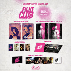
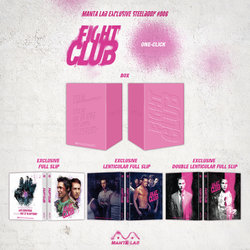
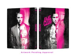
Fight Club (Blu-ray SteelBook) (Manta Lab Exclusive No. 6) [Hong Kong]

martinouchou

Premium Supporter
Sep 20, 2015
1,647
France
Release date: March 30, 2018
Purchase links: Full Slip - Single Lenti - Double Lenti - One Click (Pre-order February 16 at 8 PM HKT, UTC+8) - Check your local timing HERE
Prices: $38.99 (Full slip - Single Lenti) - $39.99 (Double Lenti) - $132.97 (One Click)
Group buys: hosted by Aniv - One Click - Double Lenti - Full Slip - Single Lenti
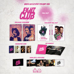
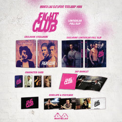
FS_packshot.jpgLS_packshot.jpgDLS_packshot.jpgone_click_packshot.jpg
Fight Club.jpg

[ME#6] Fight Club Steelbook reveal.
Took long time and some difficulties but we are super happy to reveal this artwork. Enjoy!
 
Last edited by a moderator:
Today´s delivery. Awesome package.

As I predicted, fullslip is weakest, but not that bad as I thought afterall. Holofoil is subtle and there is nice embossing and colors. Not fan of the artwork though and it hasn´t the feel of the movie at all.

Both lentis are, on the other hand, much different story :cigar:. Both have great depth and movement! :cool: Also like the rough Nova-like texture on the back of single lenti, but Im little bit disappointed with quality of that pic. Still can´t decide which lenti I like more (as a whole), but probably the single as I feel the movie most here :cigar:

All in all, great release and thanks Manta for this big time!!!:thumbs::cigar::coffee:

DSC_3242.jpg
 
Just picked up my double lenti from the post office (it originally came on Monday) and I'm really impressed with it! The steelbook has grown on me a lot too, especially after seeing it in hand... I still wish it was pink rather than orange though, since it would've matched the rest of the package better that way. Very happy with it overall... another winner from Manta! :notworthy:
 
For the quote on the back of the box set, I noticed the letter K isn't drawn out completely....and the straight like for D as well...could be an artistic choice but I noticed it right away, so was curious if that is how it was on all original posters/publicity material??
 
For the quote on the back of the box set, I noticed the letter K isn't drawn out completely....and the straight like for D as well...could be an artistic choice but I noticed it right away, so was curious if that is how it was on all original posters/publicity material??
I believe it's a font someone (probably a fan) created to try and match the official font type used... you can download it for free from Dafont.com - https://www.dafont.com/fight-this.font?text=FIGHT+CLUB

The official one is used for the opening credits of the film, but the K is very different to that used in the fan made one, whereas the D is the exact same but often connects to the previous letter.

Here's some shots from the credits so you can see for yourself...

78672b98b926bc4157c1ed15f55616e3.png
 
  • Like
Reactions: BaleHardy
Oh maan, I´ve just opened a single lenti and IT IS GORGEOUS :oohyeah::oohyeah:. That´s for me probably the best lenti Manta ever made so far! And steelbook also, I liked it already in mock up but in hand it´s even higher level, and cherry on top - scratch free copy :cigar::LOL: only two tiny paint chips (not even 1mm) but very hard to spot because of the choice of artwork/colors....

Manta....I love you again! :drool::coffee:
 
  • Like
Reactions: comICS-soon
Oh maan, I´ve just opened a single lenti and IT IS GORGEOUS :oohyeah::oohyeah:. That´s for me probably the best lenti Manta ever made so far! And steelbook also, I liked it already in mock up but in hand it´s even higher level, and cherry on top - scratch free copy :cigar::LOL: only two tiny paint chips (not even 1mm) but very hard to spot because of the choice of artwork/colors....

Manta....I love you again! :drool::coffee:

So single lenti is better than double lenti?
Even if the picture seems like blurry.
I'm curious about it.:wow:
 
So single lenti is better than double lenti?
Even if the picture seems like blurry.
I'm curious about it.:wow:

Well, for me it is slightly better, yes. It´s darker, richer in colors and that depth just immediately strikes you. Yes you are right the pic chosen is not sharpest, but I don´t mind, If you look at it from normal distance it looks sharp enough.

DL is great too, but it´s little bit too pale and you must look at it more concentrating to catch the depth and transition, but chosen art is great here!

It´s just me, I think majority will like more DL, but I prefer single, I love it.