Guardians of the Galaxy - Steelbook feedback for Disney

Would you be happy with the GOTG steelbook as currently designed?

  • Yes

    Votes: 126 23.6%
  • NO! Please give us an alternative design Disney & Marvel!

    Votes: 407 76.4%

  • Total voters
    533
Status
Not open for further replies.

apsmith21

Operations Director
Staff Member
Aug 6, 2010
28,445
USA
Attention members!

Please provide us with your feedback, alternate designs and definitely vote in the poll!

I will pass along this thread, along with your constructive feedback about how to improve upon the design that we've already been shown.

As we know, it is up to the studio to provide the final choice of artwork & design, but if this response if OVERWHELMING, we may have a shot to be heard.

Thanks in advance, as always for being members of HDN!

EDIT - To clarify, if our feedback is too late for this run, please keep in mind that this thread CAN be used for a variant steelbook release that could happen in the future! Keep those suggestions coming!
 
Last edited:
The current design is like a pair of Nike trainers without the "swoosh" design, or a Tom Cruise movie poster without his face & name in big titles LOL ….. i really dont know how ppl can defend such trash for such a big movie within the light of collectable movie merchandise ….its not even the same walkman as the one shown in the movie! :/

As far as art is concerned, I always think any Theatrical poster artwork should be the baseline, and is almost always the best option… the official movie designers create them for a reason you know? :meh: 
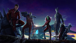
.…and its what ppl most associate with a film over time. True, sometimes new art can be better… but what we have with GOG is not even art lol ...just some fugly tech from another century most viewers of the movie never even saw b4 :squint:

MOVIE POSTER ART FTW!!!

Guardians-of-the-Galaxy-Poster-international-poster.jpg
Guardians-of-the-Galaxy-2-1308x1940.jpg
GuardiansoftheGalaxyTheatricalPoster.jpg
 

Attachments

  • guardians-of-the-galaxy-members-hd-movie-1920x1080.jpg
    guardians-of-the-galaxy-members-hd-movie-1920x1080.jpg
    1.3 MB · Views: 167
Last edited by a moderator:
I like the current design. I understand the notion of wanting every steelbook to feel like a showpiece and with that comes the mentality that they should be flashy and from a design perspective, catering to a collector with a perceived sense of effort put into how front, back and inside art come together.

I will admit that the Walkman design does not instill within me the sense that it came about as a result of trying to live up to a Marvel Back Catalogue Collection style. So then why do I like it? Precisely because of that fact I guess. I'm personally not very keen on the superhero craze nor am I too bothered about collecting Iron Man and Captain America stuff. In a sense I would draw a closer comparison to Star Wars than to The Marvel movie Franchises when I think of Guardians. To me this is reflected right through to the (comparatively) esoteric soundtrack they chose for the Awesome Mix Tape when you think of how the rest of the big budget Superhero movies are scored. In this sense I like the fact that the steelbook design breaks the mould and instead of relying on a standard AWESOME TEAM POSE DOWN cover. As a matter of fact Captain America took the same approach, its just a case of people thinking a scratched up Kurt Angle shield looks cooler than a relic for listening to cassettes. And it does I suppose - what makes the difference is Cap's shield is just iconic window dressing wheras Peter Quill's Walkman is a thematically relevant touchstone to the story. It helps to make a mundane item feel cool and important...which is a little ironic when this is what everyone in the thread is complaining about...that their tin case doesn't look special enough. I like the design and hope it doesn't change cuz I like the feeling of substance and I like the wink it gives to the people who have seen the movie. And if the idea of that seeming like a bad marketing decison - the movie has done $300 million so I don't think you need to worry about them not having made enough money.

:happy:
 
If they did the cassette player correctly, it could be cool. But this just looks like some weird generic tape player that only relates to GotG in that they also used a tape player
 
  • Like
Reactions: Ask
I'm more than pleased with the current design. I would've preferred it to be a more accurate representation of the Walkman used in the movie, but I'll take this over any of the movie posters. If not this art, then I'd vote for the art used on the vinyl soundtrack.
 
I'm surprised that a film this big hasn't got more than one verson available in the UK. Several other recent releases have had more than one, so why not this? Surely that would make people happy? This is alright for a retailer exclusive release, but I would have expected another more "basic" 2D release available from all retailers
 
WOW! :jawdrop: I'm blown away from all the Backlash this has caused! :ohno: Though I don't hate the art, but I would of preferred it on a Slipcover instead! :thumbs: I agree with @apsmith21, the cover for the Vinyl Soundtrack would of been a great choice! But the BEST choice would be this one:
95500-b7c2f389a9c4b1f327d8c536a5e2442e.jpg


But I'll be honest, I'm getting it regardless... it's the film that I LOVE, not the artwork of the Steel! :thumbs: Just sharing my thoughts! ;)
 
Oh... and I knew I saw something REALLY cool before...

Credits to @Noodles from our Custom SteelBooks Designs - Post Your Own Concept Art!
View attachment 104399
This is still my favorite GotG poster. It's from the IMAX first screening (I have it up on my wall) and would LOVE it to be used as Steelbook art.
But thats me.
View attachment 104400
These 2 would be EPIC! :cool: If Transformers 4 can get 4 or 5 different cover Steels, why the can't Guardians! The film has plenty of AWESOME potential art choices! :woot: :drool: More the better... Steels and Slips! ;) :D
 
I'm split regarding this. I like the design because it connects to the movie.
I dislike the design because it doesn't go well with the other MCU steelbooks.
 
Just thought I'd throw this in...

To say that the proposed steelbook art does not look like a walkman, or is not entirely accurate, you're correct. Now considering that Sony has a competing movie studio and would probably love to create some controversy, I think the proposed design looks as close to being an accurate walkman as I would dare to create an art design for...

WALKMAN.jpg
 
Thanks for the thread Andy.
I've voted in favor of the artwork being changed.
When the film finished, all I could think about was how great the characters were, what they did and who was my favorite .. not how great Quill's walkman was.
It's as simple as that. I want to see the characters front and center.

Rover
 
Just thought I'd throw this in...

To say that the proposed steelbook art does not look like a walkman, or is not entirely accurate, you're correct. Now considering that Sony has a competing movie studio and would probably love to create some controversy, I think the proposed design looks as close to being an accurate walkman as I would dare to create an art design for...

WALKMAN.jpg

I'm not saying it doesn't look like A Walkman, I'm saying it's not Peter Quill's Walkman.

This is the right one.
Screen-Shot-08-17-14-at-09.24-PM-001.jpg


And since I'm already being picky, the mixtape label is overdone. Not that you would be able to see it in the correct model as pictured above. But the label from the movie is very simple. Lines and the hand writing. No extra stuff:
_1400531831.jpg
 
Last edited:
I'm not a fan, but the sad fact is I'll be guying it regardless, as will a great many others.

I've simply resigned myself to Disney taking the cheap way out in terms of all their releases. From dropping special features, switching scenes and doing nothing about it (The Little Mermaid), using edited masters and doing nothing about it (Avengers Assemble) and leaving titles off steelbooks even if it's part of a 'set' (Frozen/Thor: TDW/Captain America: TWS) and constantly re-releasing the same classics over and over again with no sign of finishing the range.

They're a law unto themselves and it's clear Disney UK/Europe aren't interested in their adult collectors, just making things shiny and dumbed-down for the kids (recent O-ring packaging).
 
I'm not saying it doesn't look like A Walkman, I'm saying it's not Peter Quill's Walkman.

And since I'm already being picky, the mixtape label is overdone. Not that you would be able to see it in the correct model as pictures above. But the label from the movie is very simple. Lines and the hand writing. No extra stuff:

Yes you're right on that one. I couldn't actually remember what the walkman looked like in the movie, but here it is...

walkman2.jpg
 
  • Like
Reactions: dfoles
Status
Not open for further replies.