Last edited by a moderator:
This Is Spinal Tap (Blu-ray SteelBook) [UK]
- Thread starter snooloui
- Start date
You are using an out of date browser. It may not display this or other websites correctly.
You should upgrade or use an alternative browser.
You should upgrade or use an alternative browser.

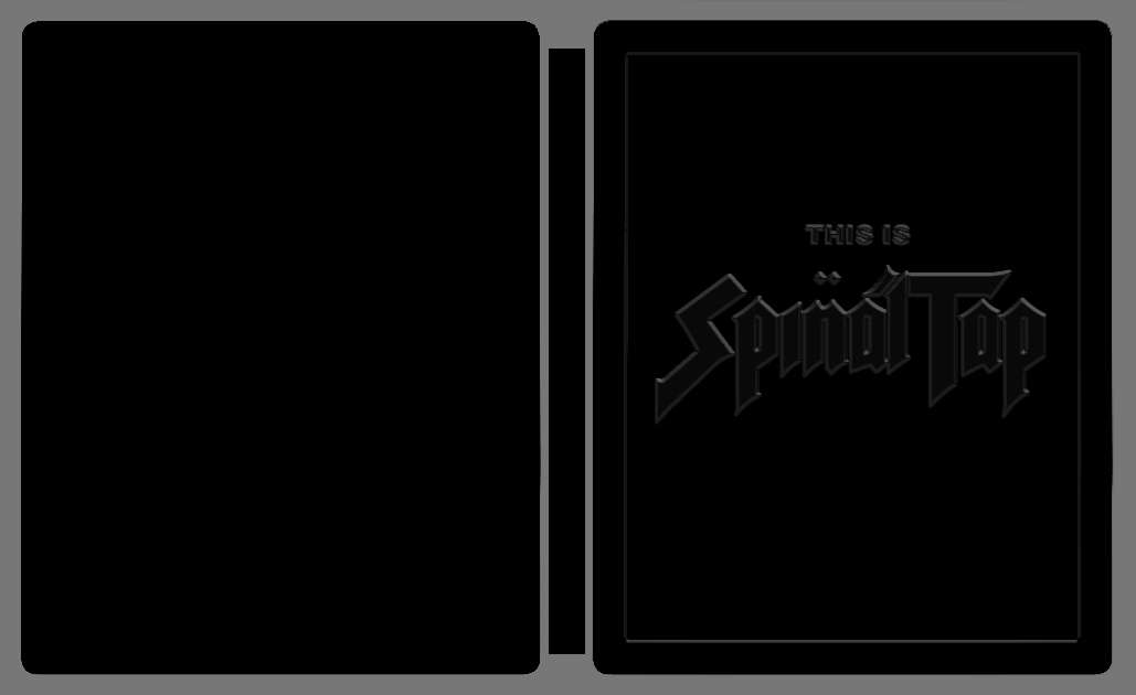
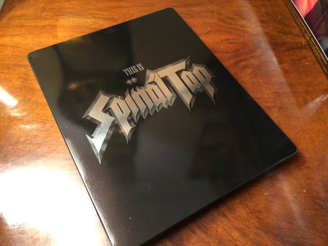
This artwork is LAZY! It's lame and looks like a placeholder rather than final artwork! The studio should be ashamed of themselves for coming up with this! A complete LACK OF EFFORT!
I would like to appeal to the studio to change the artwork before the release date. I'm sure their design team can come up with something more interesting than the Spinal Tap logo! We already have a ton of plain black SteelBooks coming out - Notably the Kubrick releases. Do we really need another boring black SteelBook?
Now I'm no artist or graphics designer by any stretch of the imagination, but here's a rough concept I just threw together in two minutes:

There, already a vast improvement over what Studio Canal are offering! Go back to the drawing board, Studio Canal!
I would like to appeal to the studio to change the artwork before the release date. I'm sure their design team can come up with something more interesting than the Spinal Tap logo! We already have a ton of plain black SteelBooks coming out - Notably the Kubrick releases. Do we really need another boring black SteelBook?
Now I'm no artist or graphics designer by any stretch of the imagination, but here's a rough concept I just threw together in two minutes:
There, already a vast improvement over what Studio Canal are offering! Go back to the drawing board, Studio Canal!
Last edited by a moderator:


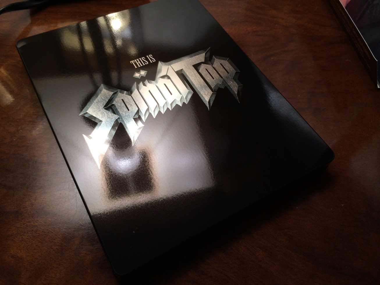
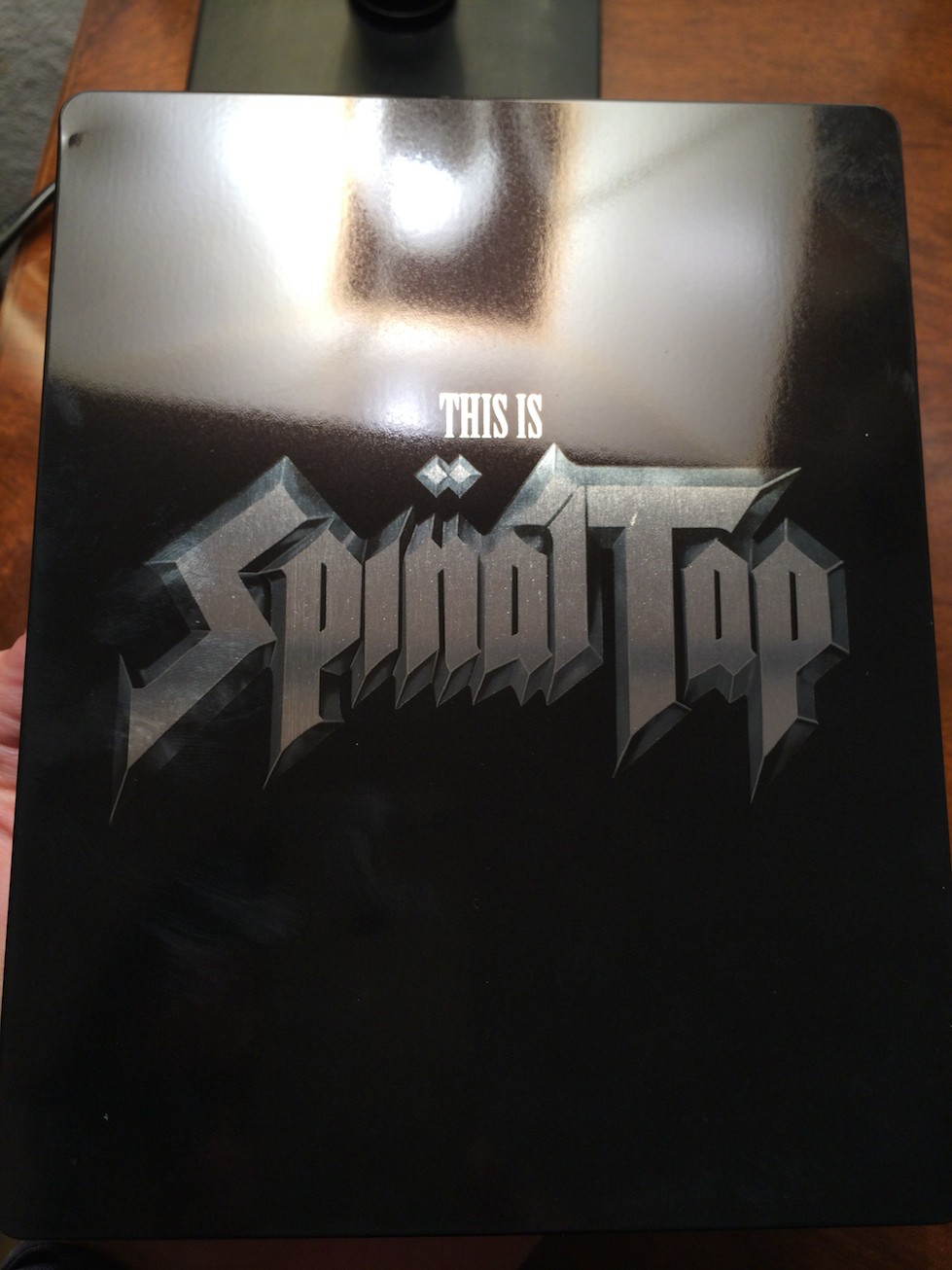
I'm hoping this is embossed, if it is, I'm spraying the whole thing black.
I think I'd still of preferred an all black cover, with a debossed title (also in black) on this.

I'm so silly, I thought is was already released and didn't purchase...I even had it in my hands 
From memory, black, glossy and it isn't embossed...I tad on the boring side I thought
From memory, black, glossy and it isn't embossed...I tad on the boring side I thought
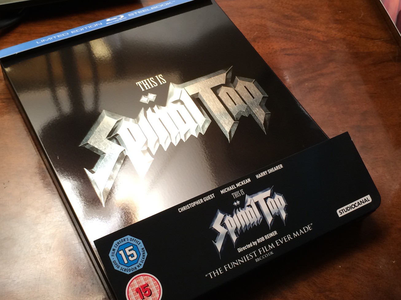
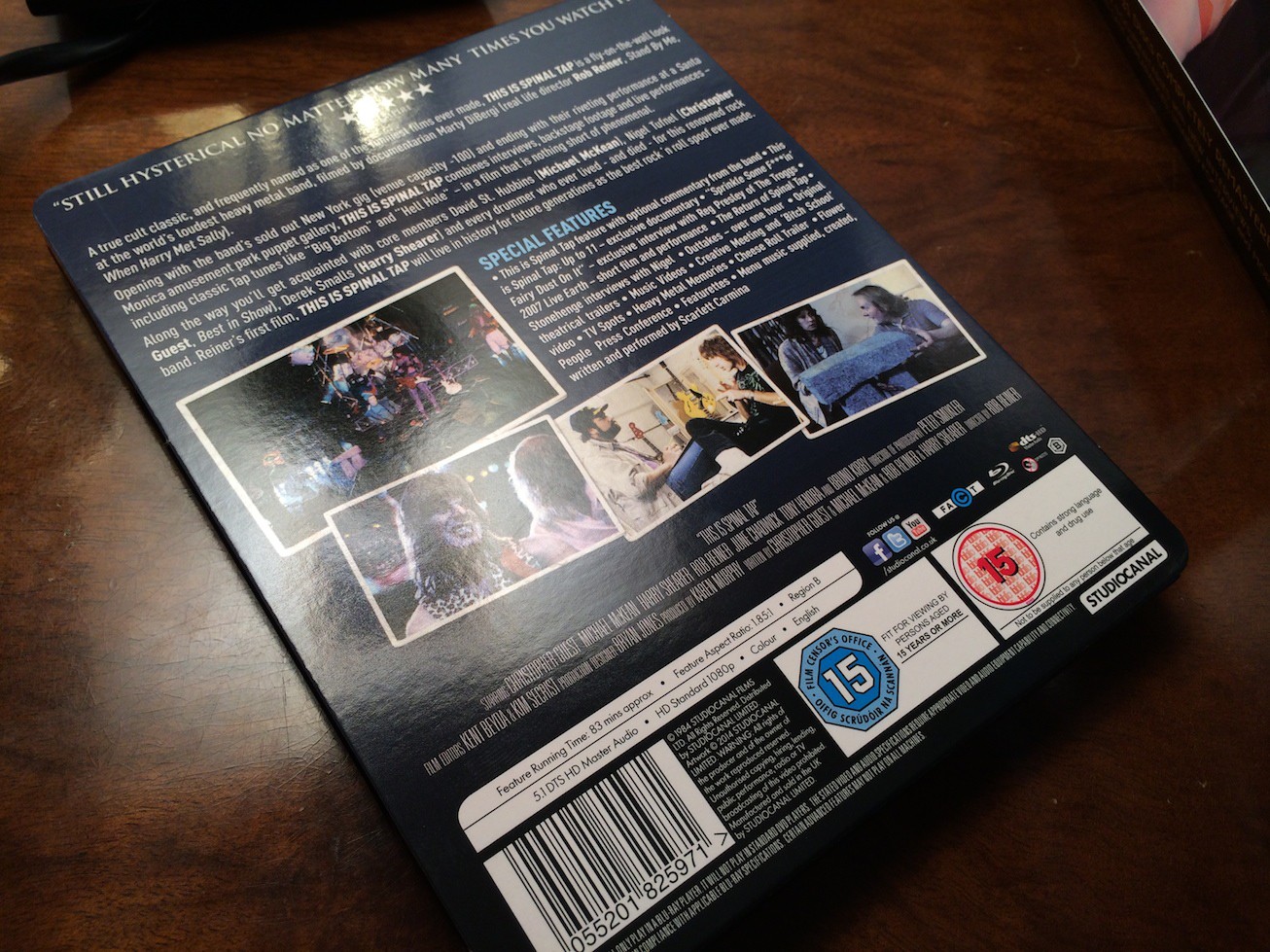
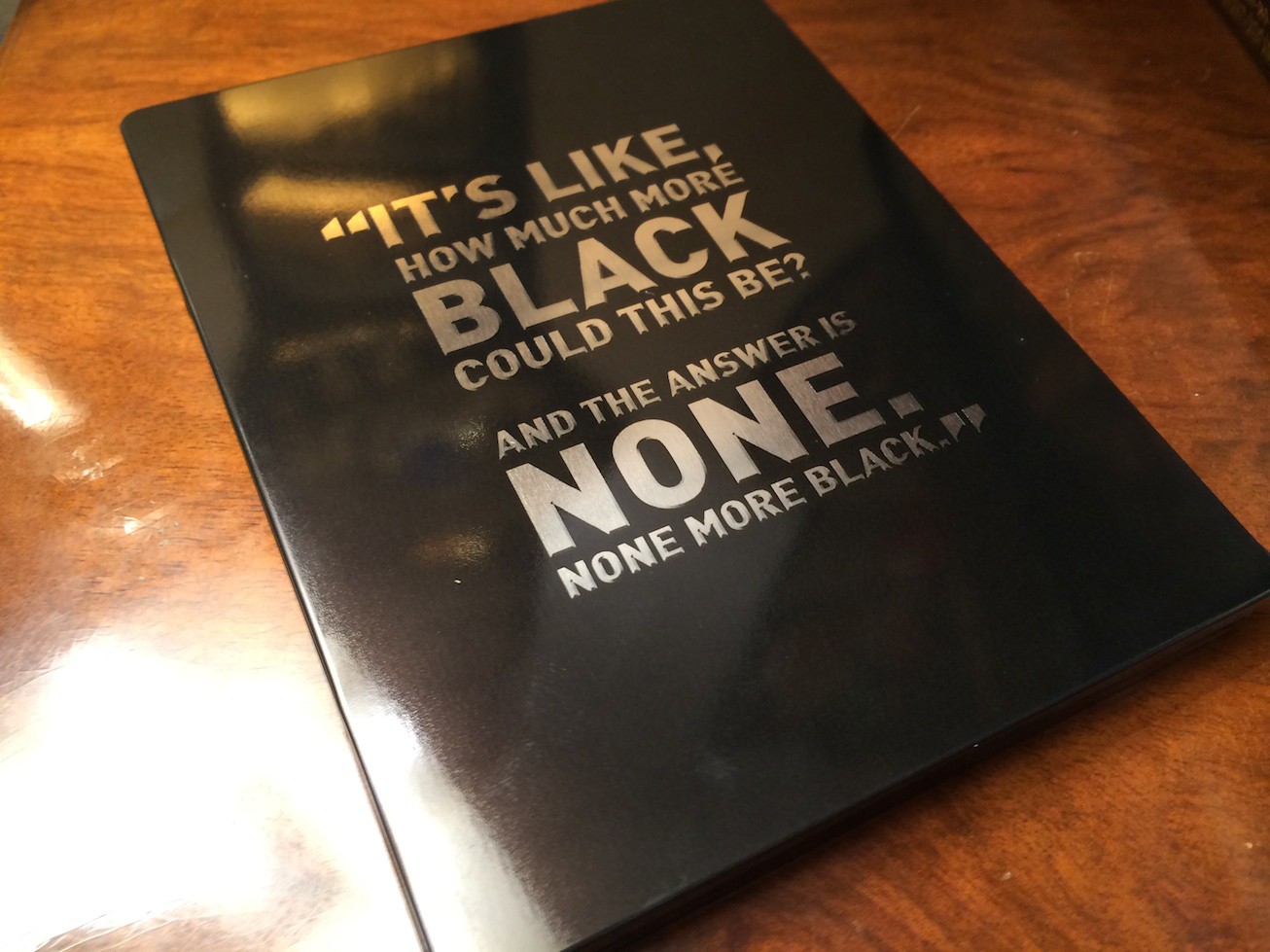
I'm still disgusted by the quote on the back like. really studiocanal. did you really need to do that. The font choice, the colour, the quote being there at all...it's all just ugh. It's like they tried to justify the design...on the design itself... Like even if you haven't seen the movie, once you see it, you'll understand the quote, it's just this bizarre exercise in futility. Bleh. Gloss would be great, probs in reference to Derek Smalls staring at his reflection in the vinyl sleeve, but I won't get my hopes up. My favourite film of all time (bar maybe Harold and Maude or The Princess Bride) just ///had/// to get a naaasty looking steel, didn't it?
Unfortunately this is just matte it seems, with no debossing I can see...

 boring looking steelbook though..will stick with the amaray, they could have done so much more with this
 And the logo isnt white, its clear finish silver. By the looks of it.
Yes sorry I got distracted by Brazil and Gravity to get any more pics but yes I can confirm it seems to just be bare silver on that logo. Minimal effort on the front, but the back and inside might look a little better. I'm assuming this isn't a remastered copy of the film and is the same as the current amaray? Seems to be a running trend of releasing 'anniversary' steelbooks without actually bothering to touch up the release that fans (of these films) can already get hold of. An exception being Fargo, but that's coming out on a (presumably cheaper, and better designed from the looks of things) amaray.
UK - Spinal Tap
Finish
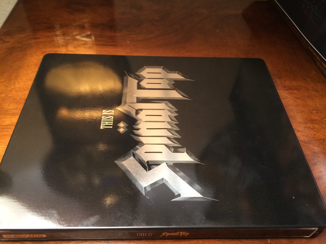
Super high gloss finish with clear finish metallic shine effect for title and rear quotes.
Comments
STUNNING Paint job. Absolutely stunning.
All images can be clicked on for a closer view. They are all high res and can be viewed at full scale.
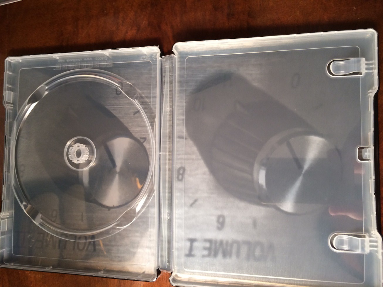
Below are shots to help show the finishing on the steel.
HDN EXCLUSIVE SHOTS
---------------------------
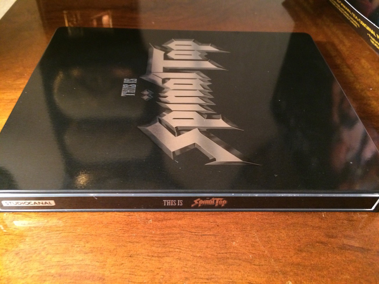
HDN EXCLUSIVE FINISHING SHOT
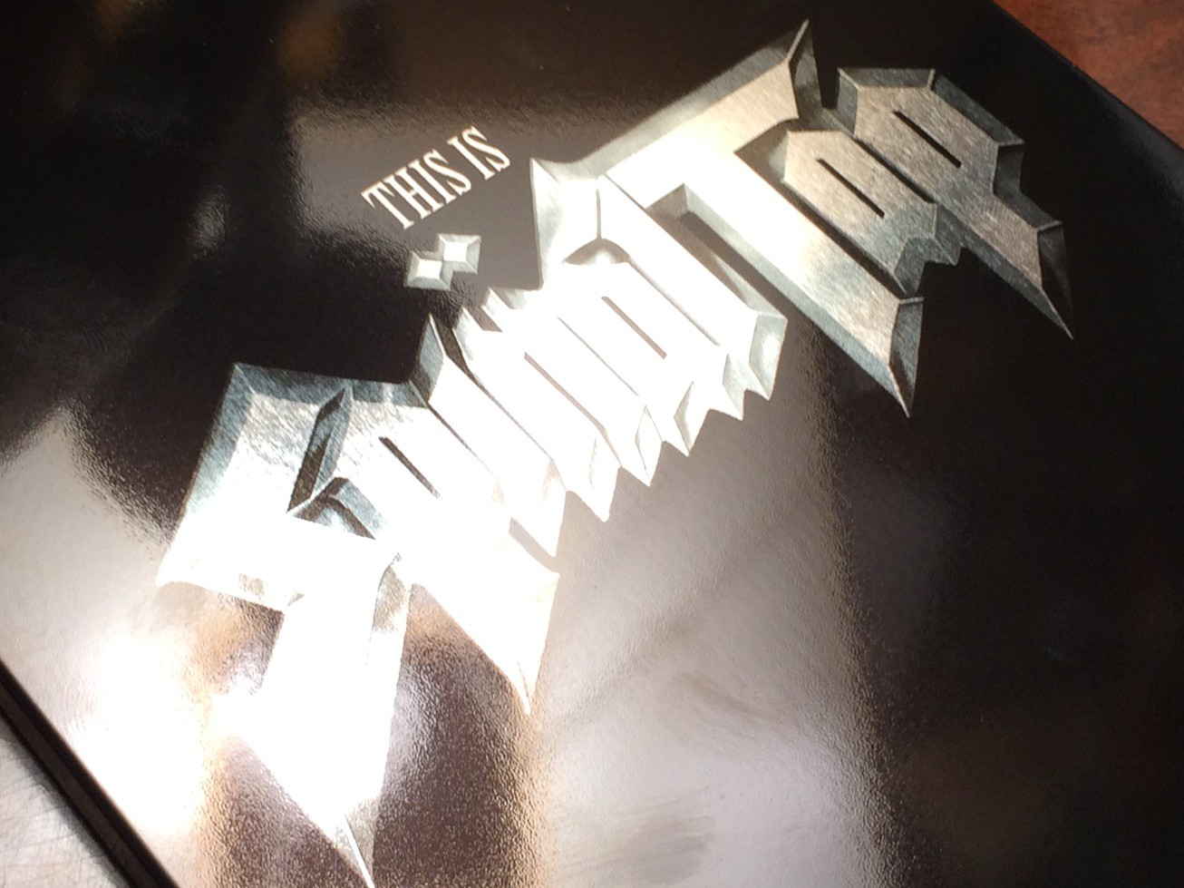
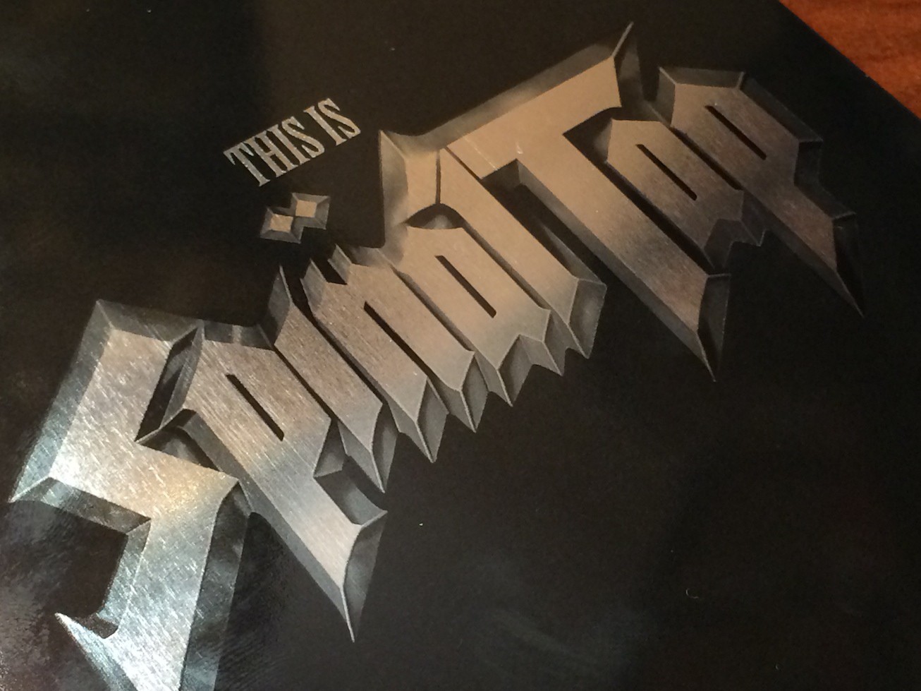
Extremely close up shot to help show you the paint job
Finish
Super high gloss finish with clear finish metallic shine effect for title and rear quotes.
Comments
STUNNING Paint job. Absolutely stunning.
All images can be clicked on for a closer view. They are all high res and can be viewed at full scale.
Below are shots to help show the finishing on the steel.
HDN EXCLUSIVE SHOTS
---------------------------
HDN EXCLUSIVE FINISHING SHOT
Extremely close up shot to help show you the paint job
Similar threads
- Replies
- 1
- Views
- 284
- Replies
- 25
- Views
- 1K
- Replies
- 28
- Views
- 3K
- Replies
- 10
- Views
- 563