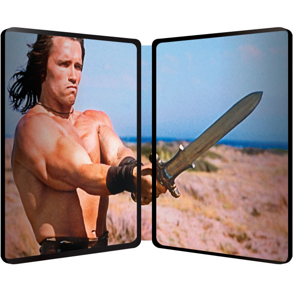
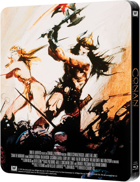
Conan the Barbarian (Blu-ray SteelBook) [United Kingdom]

snooloui

The 'Negative' Ninja
Premium Supporter
Feb 12, 2012
12,034
UK
Release date: December 2, 2013
Purchase links: Amazon UK - Base - Sainsbury's - Zavvi
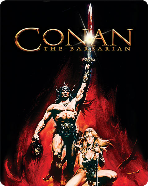
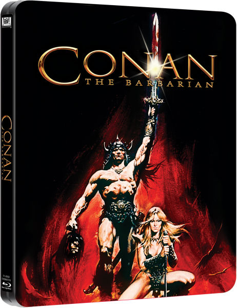
Notes: Matte finish, debossed border, embossed title, inside artwork, back cover artwork (Pics of actual SteelBook in post #183 courtesy of Bluprint)
10835798-1374681639-543311.jpg


10835798-1374681639-543277.jpg


10835798-1374681639-543189.jpg


10835798-1374681639-543306.jpg
 
Last edited by a moderator:
Hopefully they'll shrink the front a bit so that less of the artwork is cut off at the bottom.

It's a problem with the dimensions of Blu-rays in general. Just a bit too short to use theatrical poster art (especially amarays).

My thoughts exactly. Amazing artwork, but it needs to be framed a bit better.
 
Worst artwork, worst font...nothing to spend money on. This won't sell out that quickly. The French double steelbook will be the winner, even though we find some french words like L'Intégrale there...
 
Decided to pass due to altering the front art.

I found an interview with the artist Renato Casaro regarding the artwork:

I had to paint a movie poster featuring Schwarzenegger, together with the (not nude) actress. In the very first version of my poster, Conan/Schwarzenegger kept in his right hand a bloody skull. This was removed, by order of De Laurentiis - perhaps, but I don't know this, by request of MPAA regarding violence...*

Seems like Universal are just reverting back to the original now that attitudes has changed since it was first released.
 
  • Like
Reactions: harry
From the original artwork they just added a (badly drawn) head and a bit of red marker for blood on his sword!! WTF??

As someone said earlier, the art on the steelbook seems to be Renato Casaro's first version of the poster. I don't have too much of a problem with it, other than the bad composition (and maybe the title font).

Hell, I'd even prefer this...

u2uha8uj.jpg
 
Last edited:
  • Like
Reactions: harry
I like the first edition artwork Zavvi chose and prefer that it doesn't look like Arnold. It's more classic and epic that way. Besides, isn't that dual-cover spread of Arnold inside enough? :)

Agree that Zavvi's formatting could have been better as in the simple but effective modification that member stephenwilson04 made above.