Crimson Peak (Blu-ray SteelBook) (FilmArena Collection #44) [Czech Republic]

carllenc

Premium Supporter
Oct 22, 2011
10,968
Czech Republic
Release date: August 5, 2016 (Standard) - September 26, 2016 (FAC)
Purchase link: Standard - FAC
Price: 499 CZK (Standard) - 799 CZK (FAC)
Note: 1001 numbered copies (FAC)
HDN Group Buy: hosted by carllenc
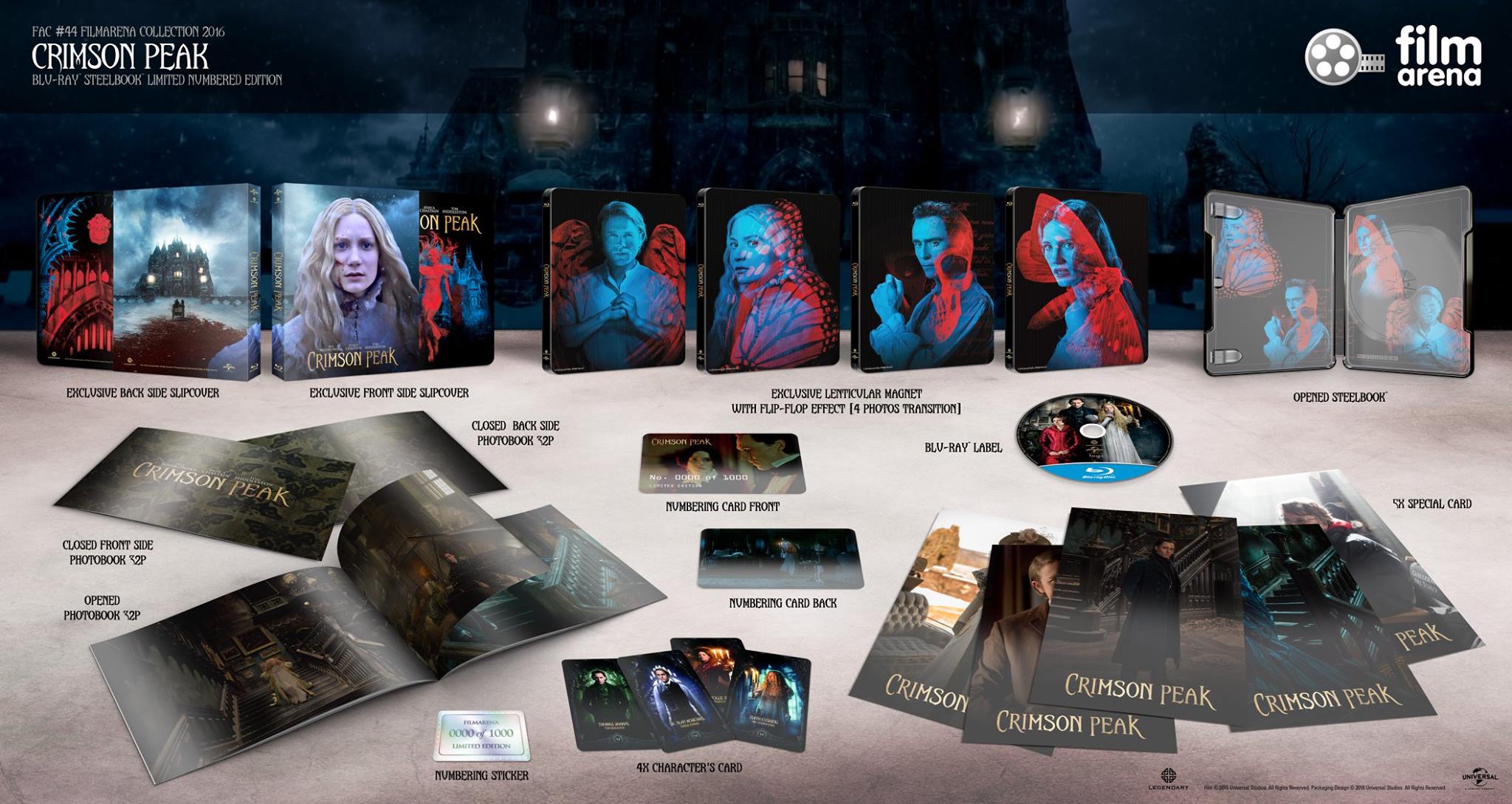
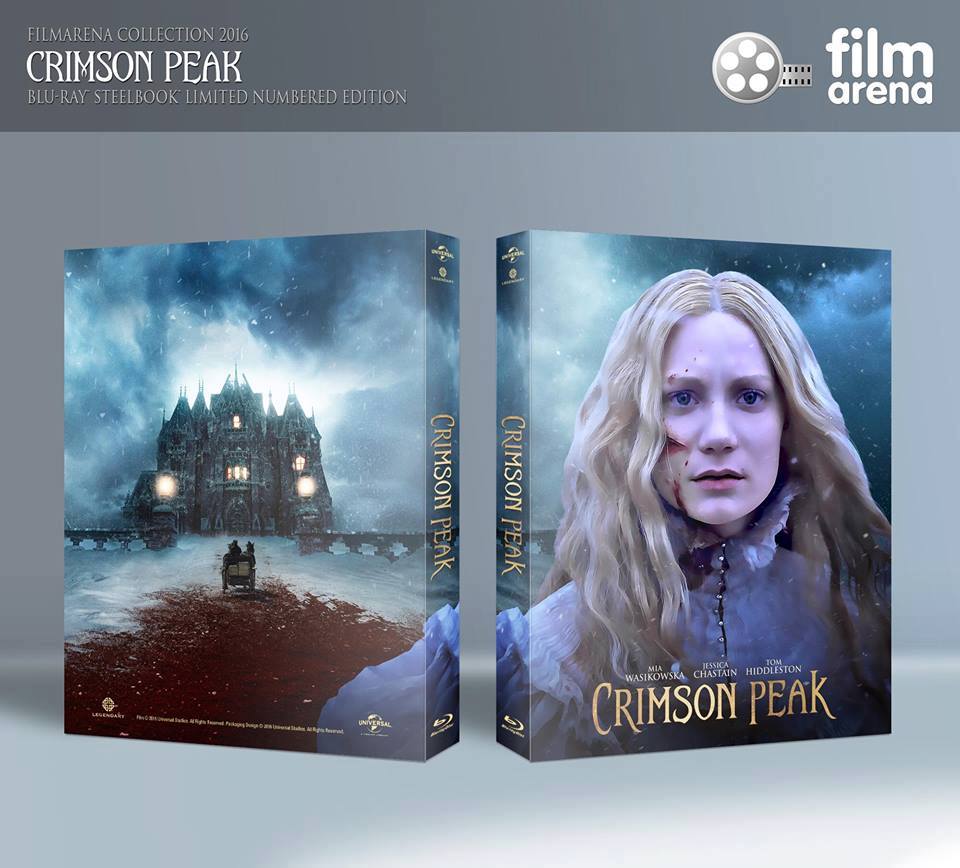
13909426_1072177166232592_2845332482769743030_o.jpg

13942211_10209840368943589_654465124_n.jpg
 
Last edited by a moderator:
No, let's not get FA on this. The front and back don't complement each other in any way, shape, or form. Whatever faults FA's version may have, it at least has perfect flow from front to back. The Mondo art is wicked, but the back would need to be something Mondo or Mondo-like as well. Which isn't going to happen at FA.

I assume it was done rapidly to show us here, I do notice the spine too, and just because the front and back don't go together doesn't mean the front, with her purple airbrushed face, is a winner.

I see Modulus' post got 14 likes (just 4 less than Carllenc's reveal of the actual art) so it seems people would like other options.

Obviously if it's Mondo then it's unlikely FilmArena could get it approved, but there's a boatload of great official promotional art for the film that we don't need to have "big heads", it was just an example of the kind of imagery I'd like to see represent Crimson Peak.

Like this for the front of the full slip:

crimson_peak_ver8_xlg.jpg

And this for the back:

crimson_peak_ver10_xlg.jpg

There we go, using official Universal art, and it's a thousand times better imo :).
 
I assume it was done rapidly to show us here, I do notice the spine too, and just because the front and back don't go together doesn't mean the front, with her purple airbrushed face, is a winner.

I see Modulus' post got 14 likes (just 4 less than Carllenc's reveal of the actual art) so it seems people would like other options.

Obviously if it's Mondo then it's unlikely FilmArena could get it approved, but there's a boatload of great official promotional art for the film that we don't need to have "big heads", it was just an example of the kind of imagery I'd like to see represent Crimson Peak.

Like this for the front of the full slip:

View attachment 257184

And this for the back:

View attachment 257183

There we go, using official Universal art, and it's a thousand times better imo :).

I've been one of the most vocal anti-big-head proponents on HDN (and on the Facebook pages of a few of these companies :LOL:), but I think FA's design on this one is a welcome exception (in theory, at least) to the usual big-head blandness, thanks to the head being part of a lovely panoramic image flowing from front to back.

That said, there are definitely problems with the execution of the image, at least in this mock-up. The main problem is that the figure of Mia Wasikowska is taken from a very low-contrast image in the film, whereas the background image is very high-contrast. This clash in the apparent lighting between the two makes it painfully obvious that her image was not originally part of that environment. It appears they have attempted to increase the contrast on Mia to a degree, but it simply isn't enough to achieve the desired illusion. Add to that the fact that they didn't blend the edges of her image into the background very well either, and you have an overall image that simply looks wrong.

But these are technical details that I think could quite possibly be significantly improved if they put the right person on it.

And I agree with you on the available promotional art for this film; both the official studio art and the Mondo art are gorgeous in my opinion. And the promotional art you showed samples of would be perfect for the slip and extras if FA is having to use the WWA steelbook for this (I can't remember if that's the case or not). Even if FA's proposed slip art were executed perfectly, it simply wouldn't complement the WWA steelbook art nearly as well (this is a problem with a lot of FA's releases).

But I have to say, as gorgeous as it all is, I've personally gotten a little tired of looking at the neon red-and-blue promotional art. I would love to see something like FA's design on a slip if it can be pulled off properly. I'd love it even more with a WEA steelbook that complements it.

I certainly wouldn't complain about a second option using nothing but the red-and-blue art, though, even if I am a little tired of it. And I'd definitely buy it, as well. My objection to the proposed change to FA's slip was based entirely on my belief that the two types of art would look terrible if paired together on the same slip :).
 
Last edited:
  • Thanks
  • Like
Reactions: Radagast and Bunk