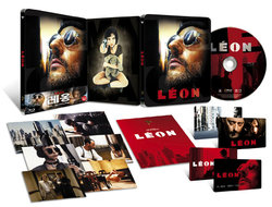
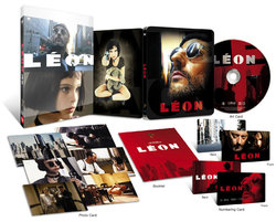
Leon (Blu-ray SteelBook) (Kimchidvd Exclusive #6) [Korea]

Which artwork candidate would convince you to buy?

  • Artwork Candidate #1

    Votes: 233 56.4%
  • Artwork Candidate #2

    Votes: 180 43.6%

  • Total voters
    413

Choi Chungkwon

Premium Supporter
Jan 28, 2013
1,726
South Korea
Release date: March 8th, 2014
Price: 34.99$
Buy link:
1/4 slip (limited to 500): here (sold-out)
Full slip (limited to 1500): here (sold-out)

List of Kimchidvd Exclusive SteelBook Editions

1/4 slip:
1389862142221743.jpg


Full slip:
13898620213161.jpg


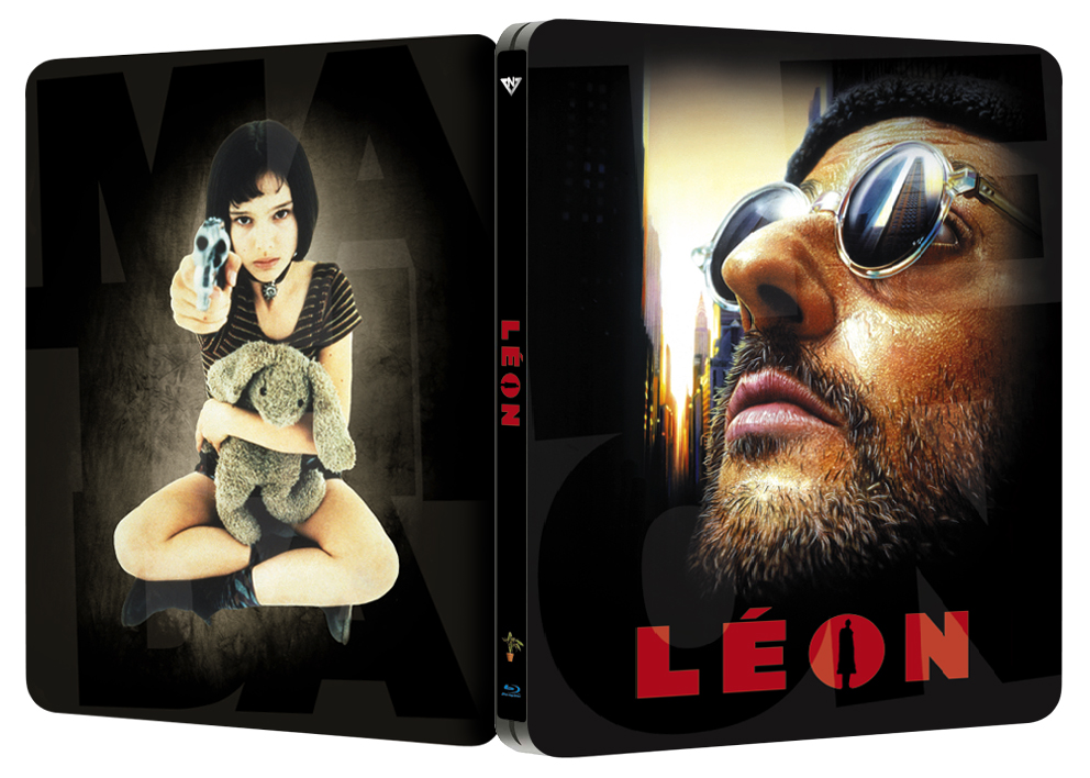
Posted artwork:
1387613246796809.jpg


Live pic

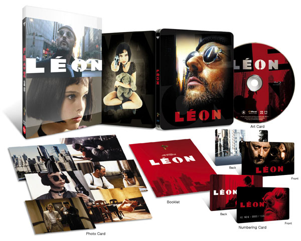
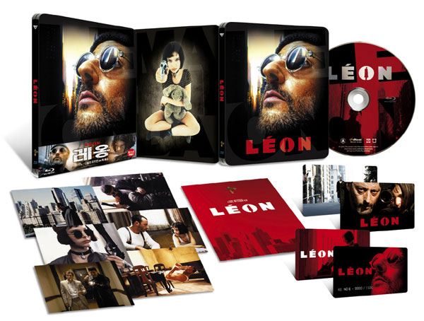
Packaging detail
- numbered plastic card
- artcard
- 6x photo card
- booklet
 

Attachments

  • 0925??_??????_????.jpg
    0925??_??????_????.jpg
    82.6 KB · Views: 771
  • 01-artwork.jpg
    01-artwork.jpg
    70.7 KB · Views: 689
  • 02-quarter.jpg
    02-quarter.jpg
    70.4 KB · Views: 668
  • 03-full.jpg
    03-full.jpg
    71.1 KB · Views: 635
  • thumb.jpg
    thumb.jpg
    23.6 KB · Views: 595
Last edited by a moderator:
I actually have an awesome limited edition litho from Leon ... black background with the plant in front of a window. All very minimal ... it's really awesome! I'll post a picture of it when I got time.

/edit: found an aweful picture of myself on facebook with the litho ... not the best picture of the thing (lot of reflection), but you get the idea. On the top it says "Reno Oldman Portman"

YSnrgjv.jpg
 
Last edited:
we have to be careful with japanese fans, Jean Reno is popular out there ... want my copy lol

instead of glass I would love to get some "reflective" effect on this steelie, sete art is very good, do not know about the back, the plant or both Portman/Reno walking down the street could be awesome

cannot wait for this :p
 
Last edited:
No thanks. Too many black colorless steelbooks.

I like the back artwork though. The weapons must be a feature of the steelbook. Can even be on the front cover embossed.
 
I think the sete54 one is the best I've seen. Yes, its a reused art but the image itself is so iconic that I couldn't imagine any other art having the same impact. I don't mind the back cover art, although I don't feel 100% about it. Either way, I can live with it. That would be the most custom art incorporated so far. Personally, I like just Léon for the title, since that was the name it was originally called worldwide, the US was called The Professional. I see what you did with the "O" on the spine. Makes it look too "cute" in my opinion.

I'm thinking black gloss similar to the older Nightmare Before Christmas steel. Black matte will make chips and scratches too noticeable I feel.

Ohhhhh and please put the title on the front. I think it looks better with it than without it.
 
I think what we need then is a different mockup with different design or color. I think its only fair that we have something to compare it too. After then we can have a vote to decide which one is better.