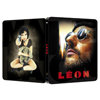
Release date: March 8th, 2014
Price: 34.99$
Buy link:
1/4 slip (limited to 500): here (sold-out)
Full slip (limited to 1500): here (sold-out)
List of Kimchidvd Exclusive SteelBook Editions
1/4 slip:
Full slip:
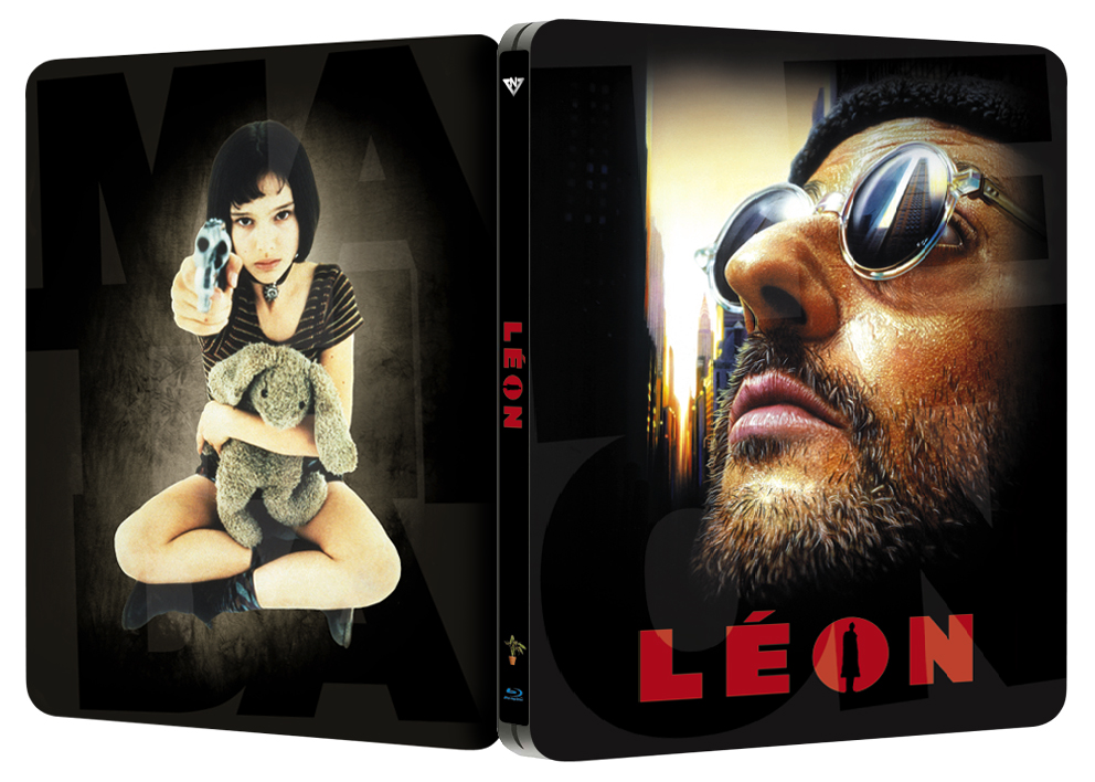
Posted artwork:
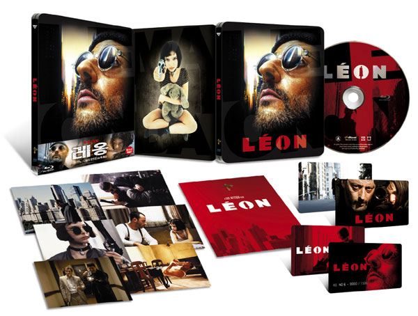
Packaging detail
- numbered plastic card
- artcard
- 6x photo card
- booklet
Price: 34.99$
Buy link:
1/4 slip (limited to 500): here (sold-out)
Full slip (limited to 1500): here (sold-out)
List of Kimchidvd Exclusive SteelBook Editions
1/4 slip:
Full slip:
Posted artwork:
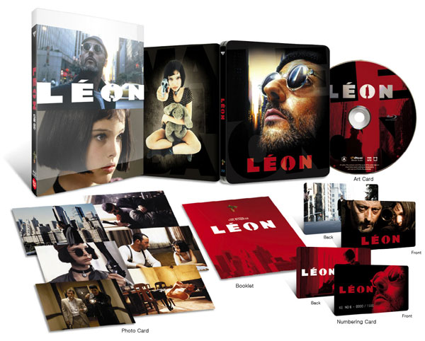
Packaging detail
- numbered plastic card
- artcard
- 6x photo card
- booklet
Attachments


Last edited by a moderator:

 too bad


")


 :bow:
:bow: 

