Received my copy of The Little Mermaid.
I still think the front has really good artwork (by far my favourite Zavvi Disney steel so far), and I also quite like the simplicity. What kills it for me is that damn vertical logo that pretty much takes the attention off the lovely (albeit non-glossy) artwork.
I actually don't mind the simplicity on the back. I am happy Zavvi didn't smack some all-stars mockup artwork thingy on it, but chose to be CONSISTENT with the front artwork, which is what a lot of people here seemed to want originally.
What I do not like about the back, is how lazy and one-dimentional it looks. I would have been happy with a background like the one on the front with smaller bubbles, that would have made it more consistent. I admire simplicity in a steelbook, as it is the opposite of what you see on most covers. But simplicity is more than one thing. That's what bothers me. You don't get the sea on the back, you get a plain blue background with a few bubbles stuck on it.
This release is also consistent with the low quality I've seem on steelbooks of late. It's got a bunch of ugly paint defects that looks like purple bubbles. It's disappointing how they didn't to do the release without those defects, but fortunately they printed a bunch of these steels so getting a replacement (If I can be bothered going through that process) shouldn't be that hard.

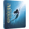


 and in excellent condition! Still sad about the lack of a good artwork, but I love the front cover
 they usually arrive under 9 days might be my first lost zavvi steel

 great conditions! i dont know why so many did not like this steel, i like it very much, i know it could be better but i'm content with it!